Code
library(openintro)Loading required package: airportsLoading required package: cherryblossomLoading required package: usdataIn today’s lab, we will learn how to use R to perform basic analyses on categorical data. We will start by using proportions/percentages to summarize categorical data numerically then proceed to creating various visualization tools for categorical variables. Interpretation of outputs is a key component of most statistical analyses so we will do that as well. The link to posit cloud is https://posit.cloud
The first thing you should do is to create an R script and save it as Lab_02. Please check out the instructions in lab 1 in case you have forgotten how to create a new file in R.
Remember that the openintro package contains the data that comes with the openintro textbook. To view a complete list of the data frames, visit https://www.openintro.org/data/. Today, we will use a data frame called sinusitis contained in the openintro package. Because the data is in the openintro package, we need to load that package first by running the command below. Recall that we had installed this package during lab 1 so we do not need to re-install it. All we need is to activate it using the library function.
library(openintro)Loading required package: airportsLoading required package: cherryblossomLoading required package: usdataNext, you need to load the data (sinusitis) into your work space. To load the data, we use the following command:
data("sinusitis")If you did everything correctly, you should be able to see a new object named sinusitis under the environment section. Click on this object to view the data. To learn more about the data, run the command ?sinusitis. How many variables and how many observations are there? What are the variable types? If there are any categorical variables, what are their levels?
We want to start by answering the following question:
What percent of patients overall reported improvement? What percent in the treatment group reported improvement? What about in the control group?
What can you conclude based on the percentages above?
Recall that a contingency table can be used to summarize data for categorical variables. It allows us to assess any possible relationships between variables. To create a contingency table for the variables group and self_reported_improvement use the command below:
table(sinusitis$group, sinusitis$self_reported_improvement)
            no yes
  control   16  65
treatment 19 66#If you want a table for one variable, just don't include the second.Notice that the table above does not have row/column totals. How do we do add this information? There are several ways but here are two:
You can taker the above code and pass through a function called addmargins as shown below:
addmargins(table(sinusitis$group, sinusitis$self_reported_improvement))
             no yes Sum
  control    16  65  81
  treatment  19  66  85
  Sum        35 131 166
Notice that the above code appears more complex and can be a little hard to read. Furthermore, writing code in that manner increases chances of making errors.
A second, and the most recommended way is to first create an object then pass that object through the function addmargins as shown below:
cont_table <- table(sinusitis$group, sinusitis$self_reported_improvement)
# This saves table as cont_table so we don't have to rewrite it.
And then,
addmargins(cont_table)
             no yes Sum
  control    16  65  81
  treatment  19  66  85
  Sum        35 131 166
Now answer the questions posed earlier.
Bar plots are some of the most commonly used visualizations for categorical variables. Note that while bar plots look very similar to histograms, they (bar plots) are primarily used for visualizing categorical variables.
We can create a simple bar plot to visualize the distribution of patients in the two groups (treatment vs control). Below is the code for doing this:
plot(sinusitis$group)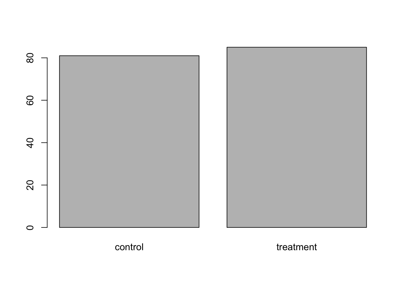
From the bar plot, we can see that the control and treatment group had nearly same number of patients with the treatment group having slightly more.
We may be interested in visualizing the distribution of cases that reported improvement in both groups. To do this, we create a side-by-side (dodged) bar plot. To do this, we can use the cont_table object created earlier as shown in the code below:
barplot(cont_table, beside = T)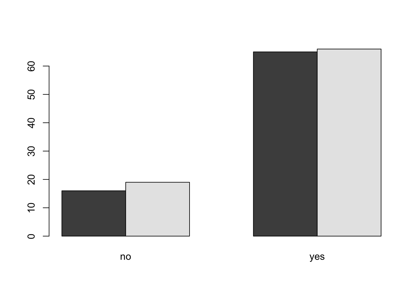
#Try to remove the argument beside=TRUE and rerun the code. What do you notice?You can add colors of your choice by using the argument col as shown below:
barplot(cont_table, beside = T, col=c("lightblue", "purple"))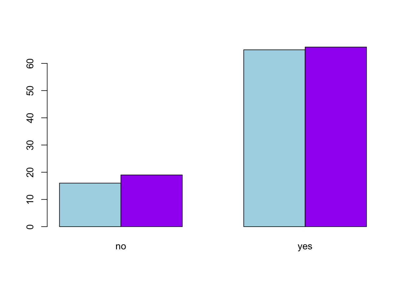
#Here, we have added a new argument called col for color.Mosaic plots are very similar to bar plots. You can create mosaic plot as shown below:
mosaicplot(cont_table)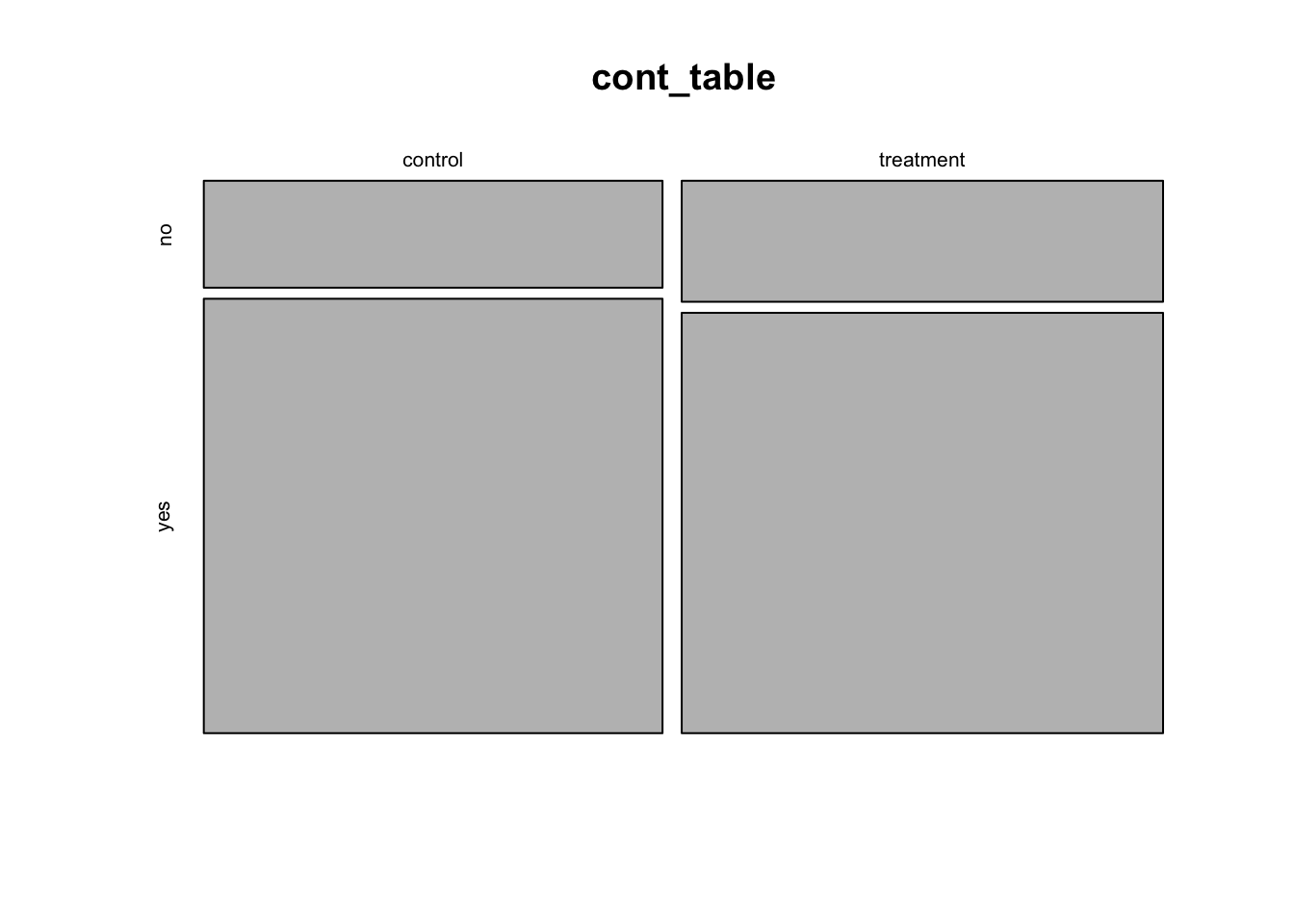
To color the mosaic plot, you can add the col argument as shown above. In general, to add more features to your visualization, you have to add more arguments and hence longer code. There are packages out there that can save you time on this. We will explore some of these in future labs.
mosaicplot(cont_table, col=c("lightgreen", "pink"))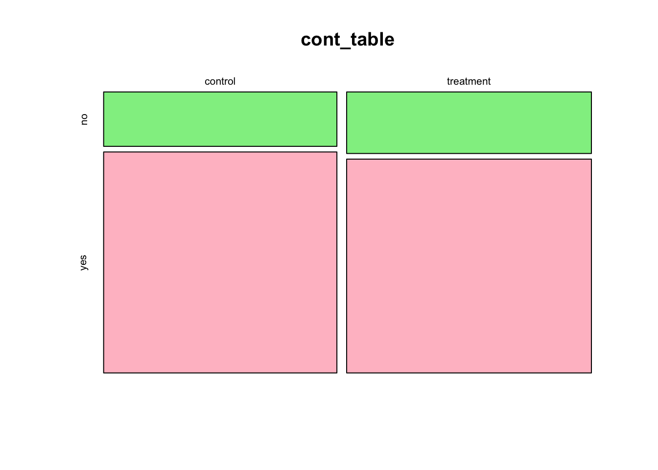
Now that you have learned various visualization tools for both numerical and categorical variables, it is important to learn how you might compare numerical variables across groups. To do this, we will import another data set called duke_forest also contained in the openintro package. Use the code below:
data(duke_forest)
#Note that this code will pull the data from the openintro package which is already loaded in this file.
As always, you want to understand the context of the your data set and the variables. Run the code ?duke_forest. Study the variables and their description.
Suppose we want to compare the distribution of the prices by the type of cooling. To do this, we can create side-by-side boxplots as shown below:
plot(duke_forest$cooling, duke_forest$price)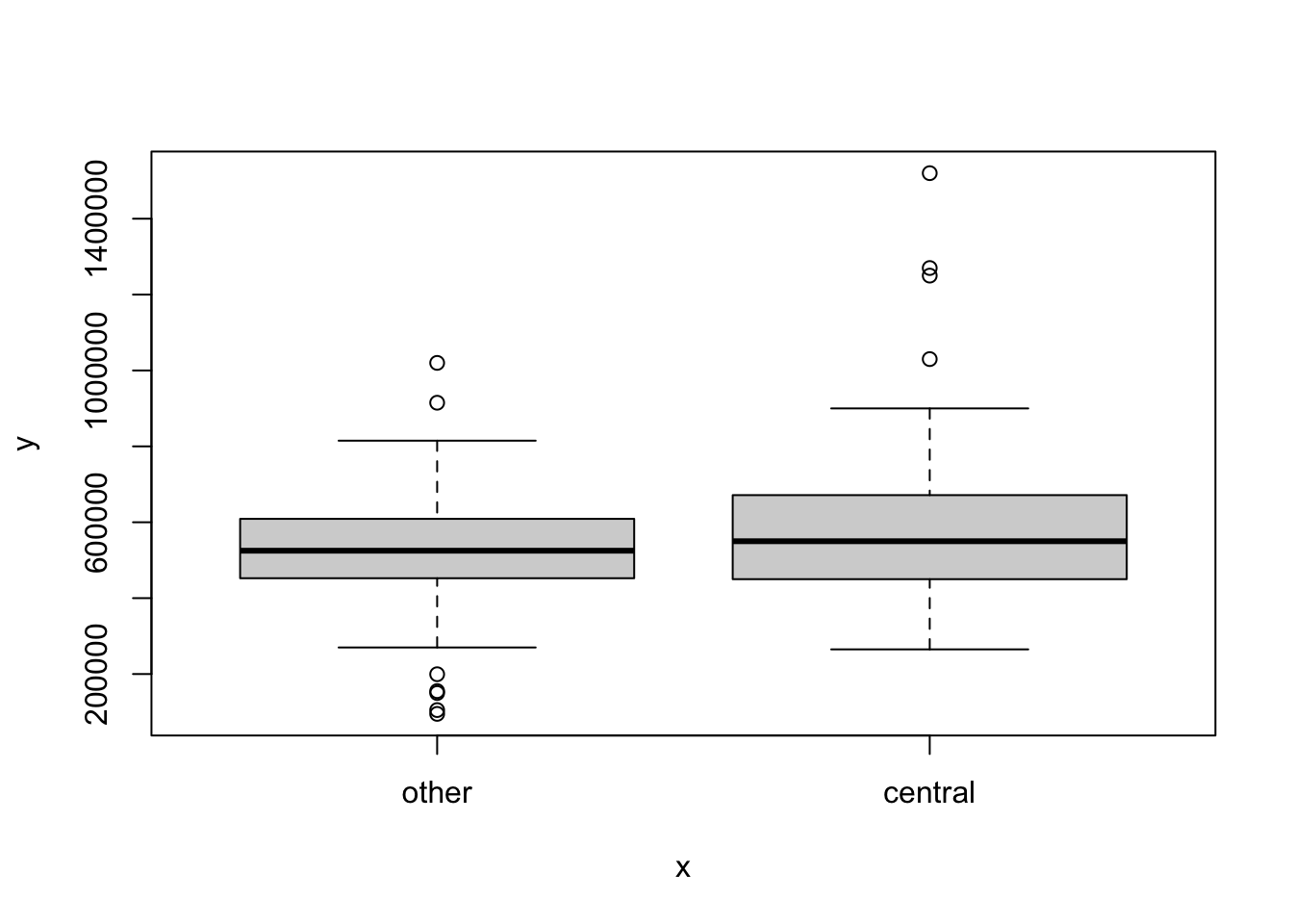
What can you say about the distribution of the price by the type of cooling?
The data frame acs12 is contained in the openintro package. Load this data set into your work space.
Run the command ?acs12 to get the documentation for the acs12 data frame set to learn more about it. In particular, how many variables does the data frame have? List all numerical variables and all categorical variables.
Create a contingency table to summarize the variables employment and race.
Based on the contingency table in exercise 3 above, compute the following statistics:
Create a simple bar plot to visualize the distribution of cases by race. Note that the \(x-axis\) should have race and the \(y-axis\) should have counts (frequency).
Create a side-by-side bar plot to visualize the variables race and employment. Be sure to have race on the x-axis and group the bars by employment.
Create a mosaic plot to visualize the relationship between the variables race and employment.
Create side-by-side box plots to compare the distribution of income by edu (education). What can you conclude about the distribution of income by education?