Code
ggplot(data= sex_discrimination, aes(x=sex, fill=decision))+
geom_bar(position = "dodge")
In this lab, we will perform simulation-based statistical inference. Specifically, we will conduct a hypothesis test for difference in two proportions via randomization, then proceed to creating a bootstrap confidence interval for the same scenario. You will use a popular statistical package called infer (short form for inference) to perform these analyses.
Log in to posit cloud and open the MATH 246 Project. Create a new quarto file with the title Intro to Statistical Inference and save the file as lab_5. If you are unsure how to do this, please refer to previous labs. Make sure the document appears under the files section with the name lab_5.qmd.
Because this is the first time you are using the package infer, you will need to install it first. To install the package, use the command:
install.packages("infer")Next, load the packages tidyverse, openintro, and infer. Use code below:
library(openintro)
library(tidyverse)
library(infer)
Before you proceed, run the above code chunk to make sure the packages loaded properly. If you are missing any packages, the program will prompt you so you can install them.
The original data used for the sex discrimination case study is contained within the openintro package. Load the data into your workspace using the code below.
data(sex_discrimination)Run the above code chunk and then click on the object sex_discrimination to view the data. To learn more about that data, you can run ?sex_discrimination in the console.
The research question of interest here is: “Are individuals who identify as female discriminated against in promotion decisions made by their managers who identify as male?” (Rosen & Jerdee, 1974). (More context in the course book section 11.1).
The null and alternative hypotheses for the sex discrimination study are as follows:
Null: There is no difference in promotion rates (proportions) between male and female candidates (i.e., There is no discrimination against female candidates in promotion decisions).
\[H_0 : p_1-p_2=0\]
Alternative: There is a difference in promotion rates between male and female candidates in favor for males (i.e., There is discrimination against female candidates in promotion decisions).
\[H_A : p_1-p_2>0\]
When performing statistical inference, it is very important to be clear on the statistic of interest. In the case of the sex discrimination study, the statistic of interest is the difference in proportions between male and female candidates. We use the letter \(\hat{p}\) (p-hat) to denote the sample proportion (a statistic) and \(p\) to denote the population proportion (a parameter). Notice that the hypotheses statements use population parameters (\(p\)). In the hypotheses above, \(p_1\) is the promotion rate for males male candidates in the population while \(p_2\) is the promotion rate for female candidates.
The observed statistic in this case is the difference in promotion rates in the sample that we have. We use this observed difference as an estimate of the true population difference (note that we do not know what it is). The observed statistic is also called point estimate. The observed statistic (point estimate) can be computed as;
\[ \hat{p}_{diff}=\hat{p_1}-\hat{p_2} \]
Let us create a bar plot to visualize the promotion rates between male and female candidates. A suitable visual is a bar plot.
ggplot(data= sex_discrimination, aes(x=sex, fill=decision))+
  geom_bar(position = "dodge")
It is often useful to have counts on the bars to make your visualization easy to interpret. We can add the geom_text() function as shown below.As usual, play around with the values for the width and the vjust to see what happens.
ggplot(data= sex_discrimination, aes(x=sex, fill=decision)) +
  geom_bar(position = "dodge") +
  geom_text(stat='count', aes(label=..count..), position=position_dodge(width=0.9), vjust=-0.5)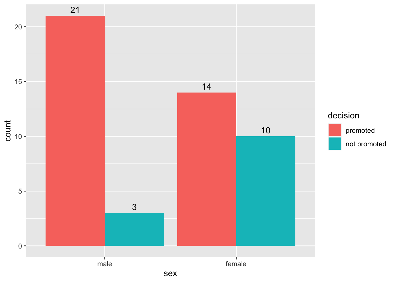
Let us compute the proportions for the promotions. We shall use the count() function to count the cases by sex and decision. After that, we group by sex then make a new column for proportions using mutate. See code below:
sex_discrimination %>%
                  count(sex, decision) %>%
                  group_by(sex) %>%
                  mutate(prop = n/sum(n))
# A tibble: 4 × 4
# Groups: sex [2]
sex decision n prop
<fct> <fct> <int> <dbl>
1 male promoted 21 0.875
2 male not promoted 3 0.125
3 female promoted 14 0.583
4 female not promoted 10 0.417# Note that the grouping (predictor) variable is gender, not decision.From this table, we see that,
\[\begin{align} \hat{p}_{diff}&=\hat{p_1}-\hat{p_2}\\ &=87.5-58.33\\ &= 0.292 \end{align}\]There are 4 main functions in the infer package that we will use over and over in coming days and weeks. The functions are:
Specify: This allows you to specify the variables and the relationships you are interested in.
Hypothesize: This is where you specify the nature of the null hypothesis.
Generate: runs the simulations to create more “data” that you can use to compute more “statistics”.
Calculate: allows you to calculate statistics from the simulated data.
Let us now use the infer package to run the simulations for the sex discrimination case study. We save the simulated data as simulated_diffs. Pay attention to how the specify, hypothesize, generate, and calculate functions have been used. See code below:
simulated_diffs <- sex_discrimination %>%
              specify(decision ~ sex, success = "promoted") %>%
                hypothesize(null = "independence") %>%
                generate(reps = 1000, type = "permute") %>%
                calculate(stat = "diff in props", order = c("male", "female"))
# The response variable is decision and predictor is sex
# Our "success" outcome in the case is "promoted".
# We set null to "independence" (i.e., decision and sex are independent)
# We generate 1000 samples (you can do more or less) by permutation/randomization.
# The statistic of interest is "diff in props", and we subtract in order male -female
Run the above code and study the object simulated_diffs that appears in the environment area. The column titled replicate represents the shuffle number. We have 1000 shuffles (replicates). The second column (stat) represents the differences computed from each replicate just like we did in the actual shuffle with cards.
Next, we want to create a histogram to visualize the distribution of the differences computed above. Remember we stored the differences as simulated_diffs. We will also place a vertical line on the histogram to visualize the location of the observed statistic (the original difference of 0.292):
            ggplot(data=simulated_diffs, aes(x = stat)) +
            geom_histogram()+
            geom_vline(aes(xintercept = .292), color = "red")
`stat_bin()` using `bins = 30`. Pick better value with `binwidth`.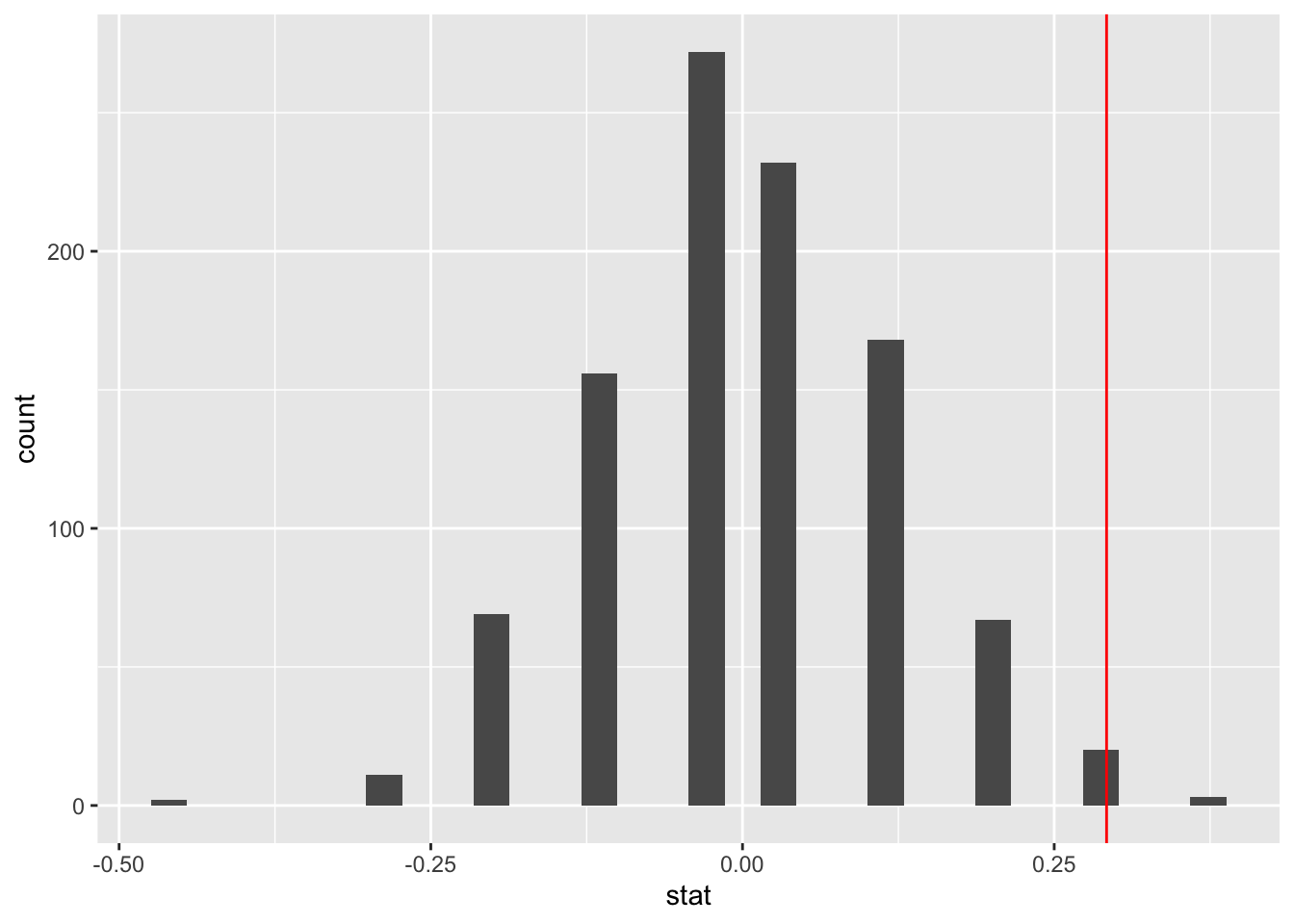
The P-value is the percent of scores that are at or beyond the observed statistic (i.e., the red line). It is the probability of observing a difference as extreme as 0.292 assuming that the null hypothesis is true (i.e., that there is no discrimination going on). The infer package comes with a function known as get-p-value() for computing the p-value from the null distribution (i.e., our simulated_diffs). See code below:
simulated_diffs %>%
            get_p_value(obs_stat = 0.292, direction = "greater")
# A tibble: 1 × 1
p_value
<dbl>
1 0.003# The argument obs_stat is for the observed statistic.
# The argument direction is for the kind of hyp test (in this case right-tailed)The whole point of doing this is to answer the question, “Is there discrimination going on against female applicants?”. Now, with a P-value of 0.03, it means that if there was no discrimination going on we would would expect to see a difference of 0.292 about 3% of the time. As you would agree, this is a very rare observation. This means that the data provides strong evidence against the null hypothesis. We can conclude that discrimination is likely going on against female candidates.
It is common to use a cut off point of 5% to decide whether the null hypothesis is likely false. The cut off point used is often called a significance level. This is the value used in many parts of the text.
The hypothesis test tells us whether there is discrimination going on or not. It does not tell us anything about the magnitude (the difference in proportions) of the discrimination in the population. To estimate the magnitude of this difference, we create confidence interval, i.e., a range of values within which we expect to find the true difference in promotion rates (i.e., \(p_1-p_2\)). In most cases, we run both hypotheses tests and confidence intervals because the two compliment each other.
below is the process for creating the confidence interval:
Just like in the hypothesis test case, we need to find the observed statistic first. We can use infer to do this. Notice that we are skipping the hypothesis and generate steps. We are also saving the observed statistic as d_hat.
d_hat <- sex_discrimination %>%
  specify(decision ~ sex, success = "promoted") %>%
  calculate(stat = "diff in props", order = c("male", "female"))
print(d_hat)
Response: decision (factor)
Explanatory: sex (factor)
# A tibble: 1 × 1
stat
<dbl>
1 0.292Notice that this is the same value as we got from the hypothesis test.
Next, we generate the bootstrap distribution:
boot_dist <- sex_discrimination %>%
  specify(decision ~ sex, success = "promoted") %>%
  generate(reps = 1000, type = "bootstrap") %>%
  calculate(stat = "diff in props", order = c("male", "female"))
Once you run the bootstrap samples, click to view the data. You have a list of 1000 differences generated via bootstrapping. Notice that we skipped the hypothesis step in the infer pipeline because this is not a hypothesis test.
Next, you can create a histogram distribution of this distribution. Notice that it is centered around 0.292. This should not come as a surprise.
ggplot(data=boot_dist, aes(x = stat)) +
            geom_histogram(binwidth = .05)+
            geom_vline(aes(xintercept = .292), color = "red")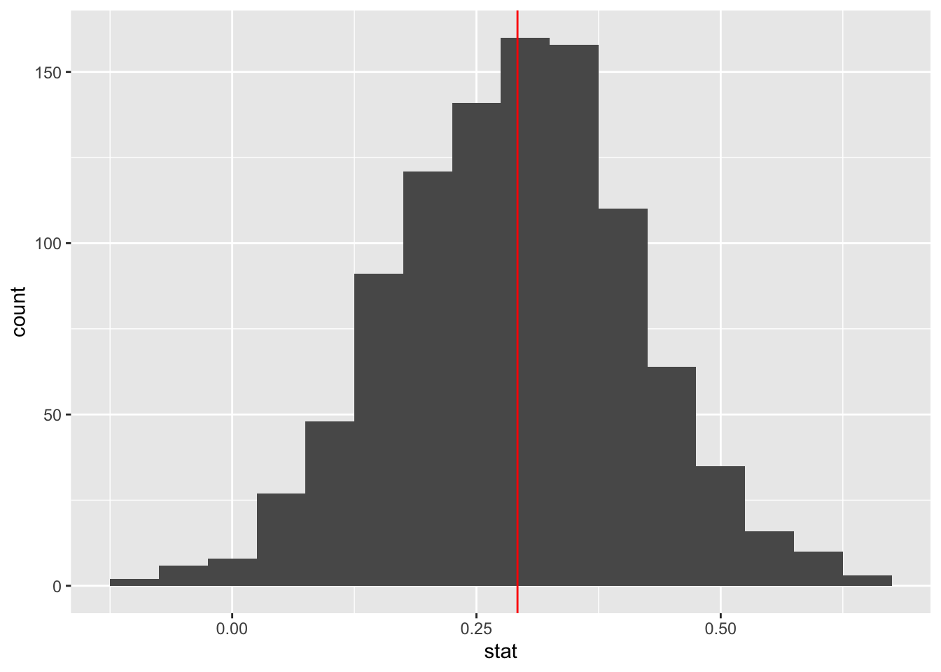
The function get_ci is used to create the confidence interval once you have generated the bootstrap distribution. By default, function creates a 95% confidence interval. This gives you the middle 95% of the data (in this case the simulated differences). The interval is built around the observed statistic.
percentile_ci <- get_ci(boot_dist)
print(percentile_ci)
# A tibble: 1 × 2
lower_ci upper_ci
<dbl> <dbl>
1 0.0498 0.534Below is a way to use the built-in infer function to visualize the interval:
visualize(boot_dist) +
  shade_confidence_interval(endpoints = percentile_ci)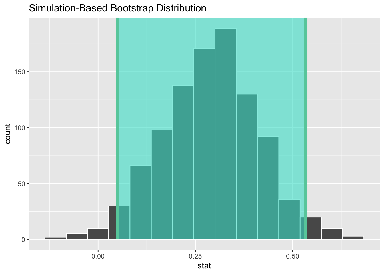
We interpret the interval as follows: We are 95% confident that the true difference in promotion rates between male and female applicants is between 0.06 and 0.53 (or 6% and 53%).
Notice that the interval we found does not include 0. This means that 0 is not a viable value. We had also rejected null hypothesis and so the results of the confidence interval and the null hypothesis are in agreement.
How rational and consistent is the behavior of the typical American college student?
One-hundred and fifty students were recruited in a study that aimed to understand whether reminding college students about saving money for later would make them more thriftier. The students were split into 2 equal groups (control and experiment) and were asked to respond to the following prompt:
“Imagine that you have been saving some extra money on the side to make some purchases, and on your most recent visit to the video store you come across a special sale on a new video. This video is one with your favorite actor or actress, and your favorite type of movie (such as a comedy, drama, thriller, etc.). This particular video that you are considering is one you have been thinking about buying for a long time. It is available for a special sale price of $14.99. What would you do in this situation? Buy video or Not buy video?”
The data set for this study is available in the openintro package and is called opportunity_cost. Load all required packages (openintro, infer, and, tidyverse) and then load the data into your work space. As usual, you want to explore the data before you start your analyses.
Recommended reading: Section 11.2 of the course text.
State the hypotheses (null and alternative) in words and in symbols. (2 pts)
Create a dodged bar graph to visualize the data. Be sure to show the frequencies on the bars. (2 pts)
Use the count and group_by functions to create a summary table summarizing the results. Compute the observed statistic. (2 pts)
In this problem, you will run a simulation-based hypothesis test to test the null hypothesis that you stated in exercise 1 above.
Use the infer package to run 1000 simulations for the hypothesis test. Save the simulations as simulated_data. (4 pts)
Create a histogram to visualize the distribution of the simulated_data. Include a vertical line showing the location of the observed statistic. (2 pts)
Use the get_p_value function to find the P-value. Based on this P-value and a significance level of 0.05, write a conclusion for your hypothesis test in context. (2 pts)
Create a confidence interval to estimate the parameter of interest. Write an interpretation of your interval and state whether it agrees with the results of your hypothesis test. (6 pts)