Code
data(duke_forest)
data(sinusitis)In today’s lab, we introduce a popular package called ggplot2 used for data visualization. This package is contained within the tidyverse package (already installed) so we do not need to install it separately. The term ggplot stands for “Grammar of Graphics Plot” which is a system for declaratively creating graphics. It provides a programmatic interface for specifying what variables to plot, how they are displayed, and general visual properties. The package allows users to create a wide variety of high-quality and customizable statistical graphs, making it a valuable tool for data exploration and presentation.
To create your quarto file, follow the following steps:
Go to File>New File > Quarto document. In the title field use Introducing ggplot2 then write your name under the Author field. Change the output option to pdf.
Next, save the document as Lab_03b. If you did it correctly, the file Lab_03b.qmd should appear under the environment.
For more details on creating a quarto file, please check out lab_03a.
Your document comes with some text and code chunks by default. You can delete the code in the chunks and put your own code when needed. In the fields with text, you can insert your own text. The previous lab provides information on how to add new chunks and text in quarto. You will learn about formatting a quarto document as we progress.
We will need the following packages in today’s lab:
ggplot2 package as well as other important functions.Create a code chunk and load the following packages using the code below:
library(openintro)
library(tidyverse)We will need the following data sets: duke_forest and sinusitis both contained in the openintro package. Load the data sets using the commands below:
data(duke_forest)
data(sinusitis)
Note that although you had loaded the data in previous labs, you loaded it in specific documents. You have to load the data in every new quarto document that you create, otherwise, the document may not render.
At this point, you want to render your document to check if it produces a pdf.
In Lab03a, we computed numerical summary statistics using the variable price in the duke_forest data set. In this lab, we demonstrate how to use the ggplot2 package to create the various visualizations for the price variable.
There are three basic steps in creating visualizations using ggplot2. These are:
ggplot(data = duke_forest)
ggplot(data = duke_forest,
       mapping = aes(x = price)
       )
geom_dotplot(). Notice that you must have the parentheses because this is a function that can take more arguments (you will learn more about this) to further define the nature of the dots added.ggplot(data = duke_forest,
mapping = aes(x = price)
) +
geom_dotplot()Bin width defaults to 1/30 of the range of the data. Pick better value with
`binwidth`.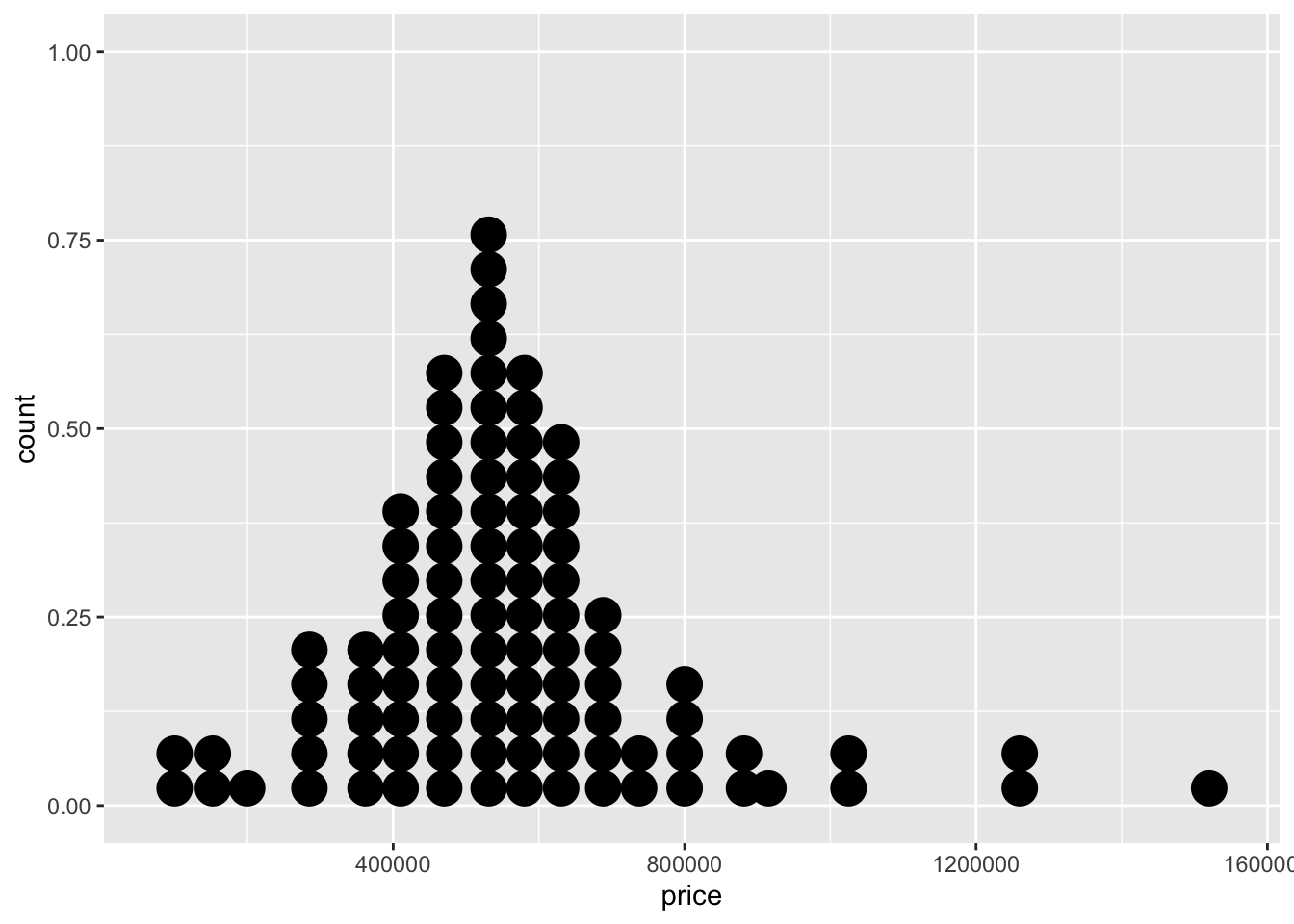
Another tool we can use to visualize the distribution of a single numerical variable is a histogram. To create a histogram for the price variable, we follow the exact same steps as above but only change the geom_dotplot part to geom_histogram. See below:
ggplot(data=duke_forest,
       mapping = aes(x = price)
       ) +
       geom_histogram()
`stat_bin()` using `bins = 30`. Pick better value with `binwidth`.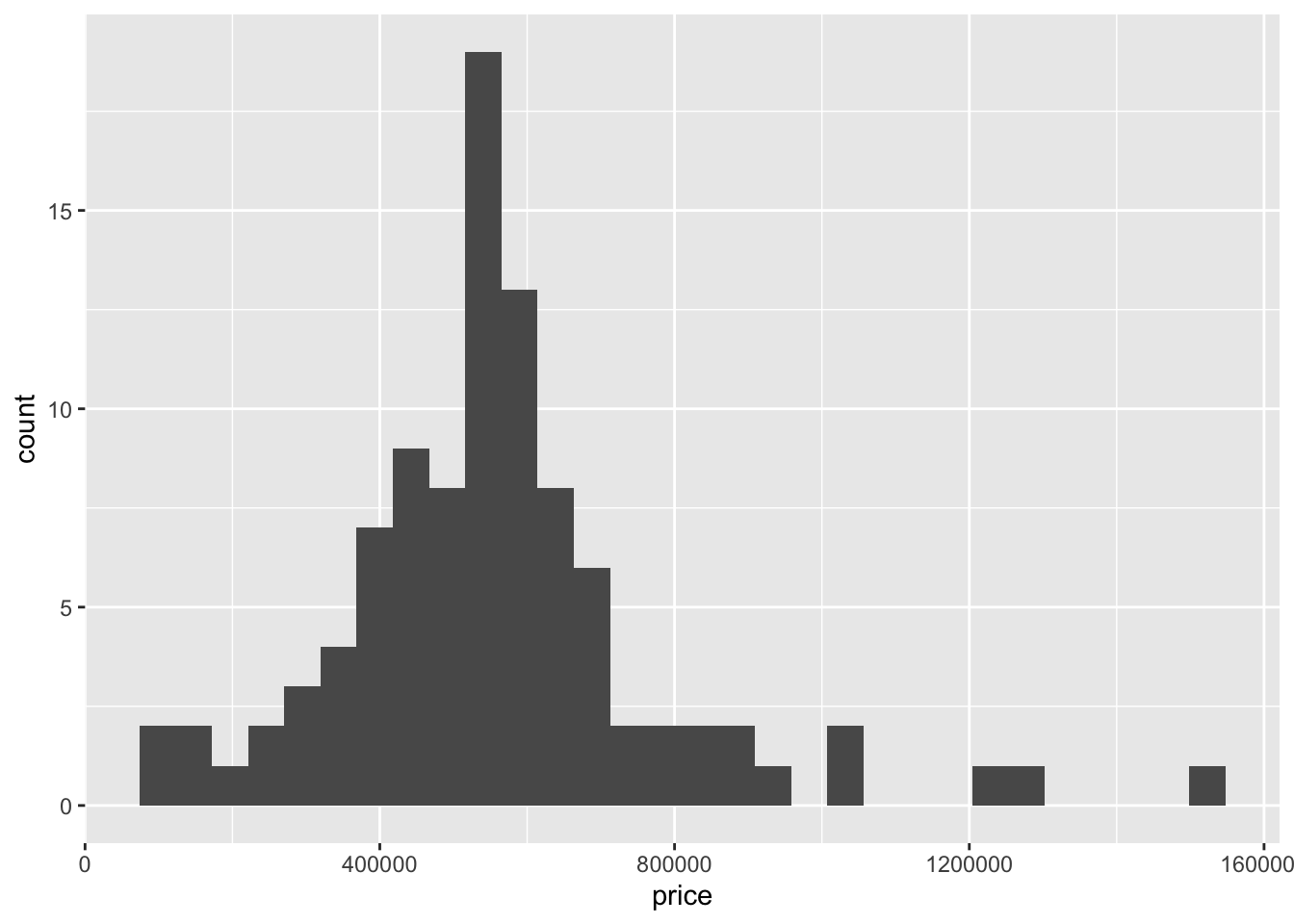
We can also create a boxplot in the same way but change the geometry to geom_boxplot. See below:
ggplot(data = duke_forest,
       mapping = aes(x=price)
       ) +
       geom_boxplot()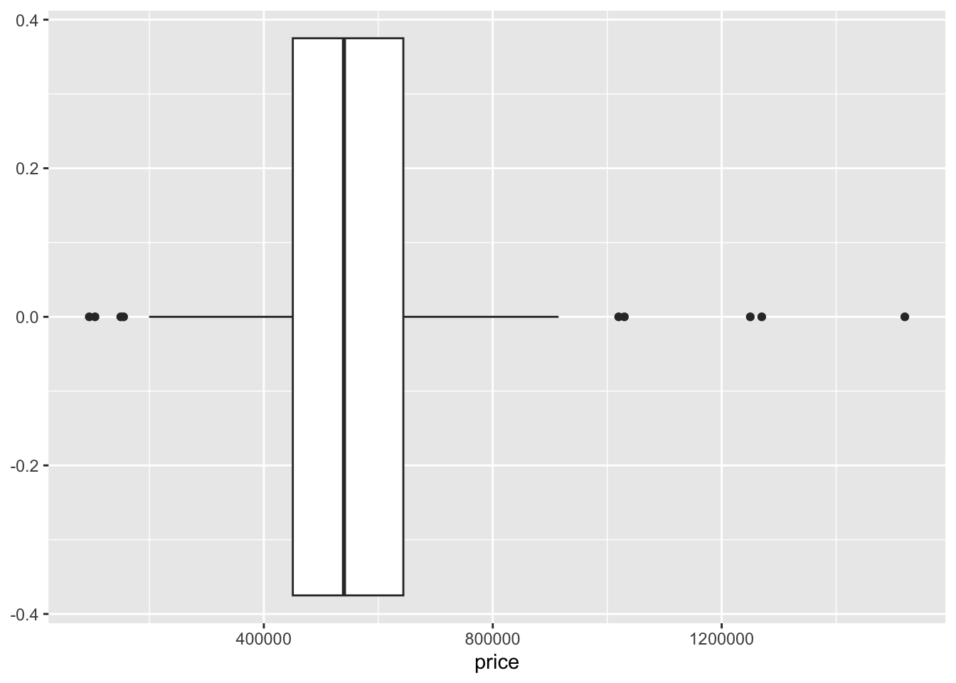
Question:
In many cases, we want to assess relationships between two numerical variables. A scatter plot is the most commonly used visualization tool for this. To create a scatter plot, you just need to specify the variable on the \(x-axis\) and the one on the \(y-axis\). In addition, you will use geom_point as the geometry.
Suppose we want to assess the association between price and area. Use the code below:
ggplot(data = duke_forest,
       mapping = aes(x = area, y = price)
       ) +
       geom_point()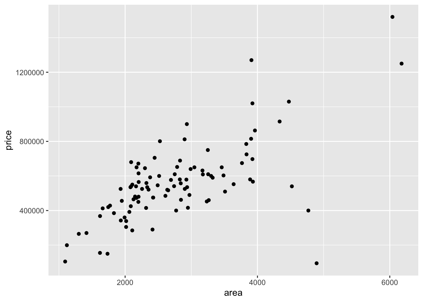
Question - What pattern do you notice from the above scatter plot? Is this what you expected?
You can add some layer of complexity to the scatter plot to allow you compare three variables. For example, you may want to compare the relationship between price and area by cooling. To do this, you use the color argument as shown below:
ggplot(data = duke_forest,
       mapping = aes(x=area, y = price, color = cooling)
       ) +
       geom_point()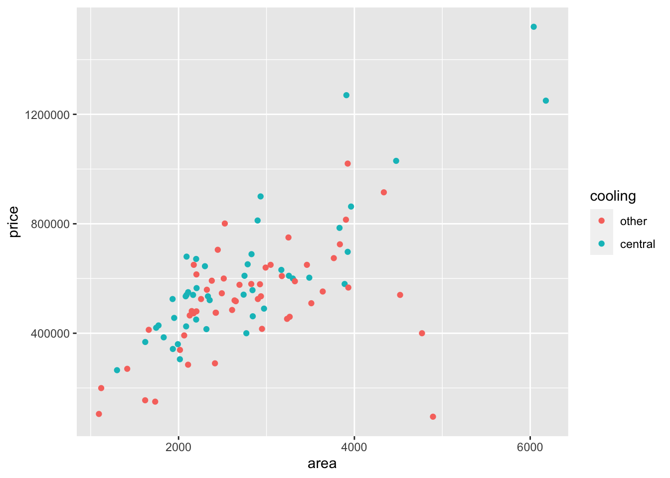
Question - What patterns do you notice above?
You can visualize a single categorical variable using tools such as simple bar plots and pie charts.
The data set sinusitis contains two categorical variables (group and self_reported_improvement). Suppose we want to visualize the distribution of cases by self_reported_improvement. We follow the same structure as above but change the geom() part to geom_bar(). See code below:
ggplot(data = sinusitis,
       mapping = aes(x = self_reported_improvement)
       ) +
       geom_bar()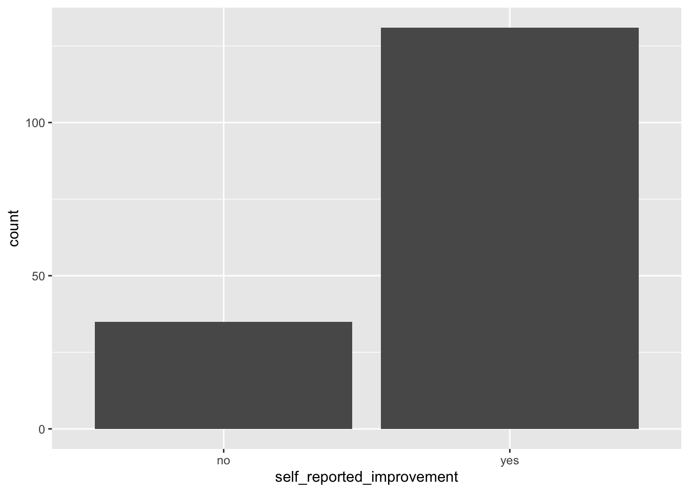
if you want to color the bars, you can do so by adding the argument fill= in the aes. This will automatically fill the bars using some colors. See below:
ggplot(data = sinusitis,
       mapping = aes(x = self_reported_improvement, fill=self_reported_improvement)
       ) +
       geom_bar()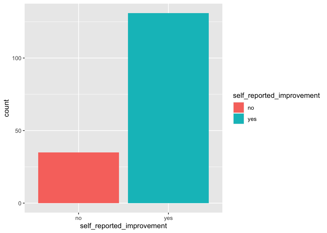
We can use stacked bar plots or side-by-side bar plots to visualize two categorical variables. For example, we may want to to visualize the relationship between group and self_reported_improvement from the sinuisitis data set.
We can create a bar plot by simply using the second variable (in this case group) in the fill argument.
ggplot(data=sinusitis,
       mapping = aes(x = self_reported_improvement, fill = group)
       ) +
       geom_bar()
As we have seen, stacked bar plots are not easy to interpret and so we prefer side-by-side bar plots.
To create a side-by-side by plot, we simply add the argument position=dodge in the geom() function. See below:
ggplot(data = sinusitis,
       mapping = aes(x = self_reported_improvement, fill = group)
       ) +
       geom_bar(position = "dodge")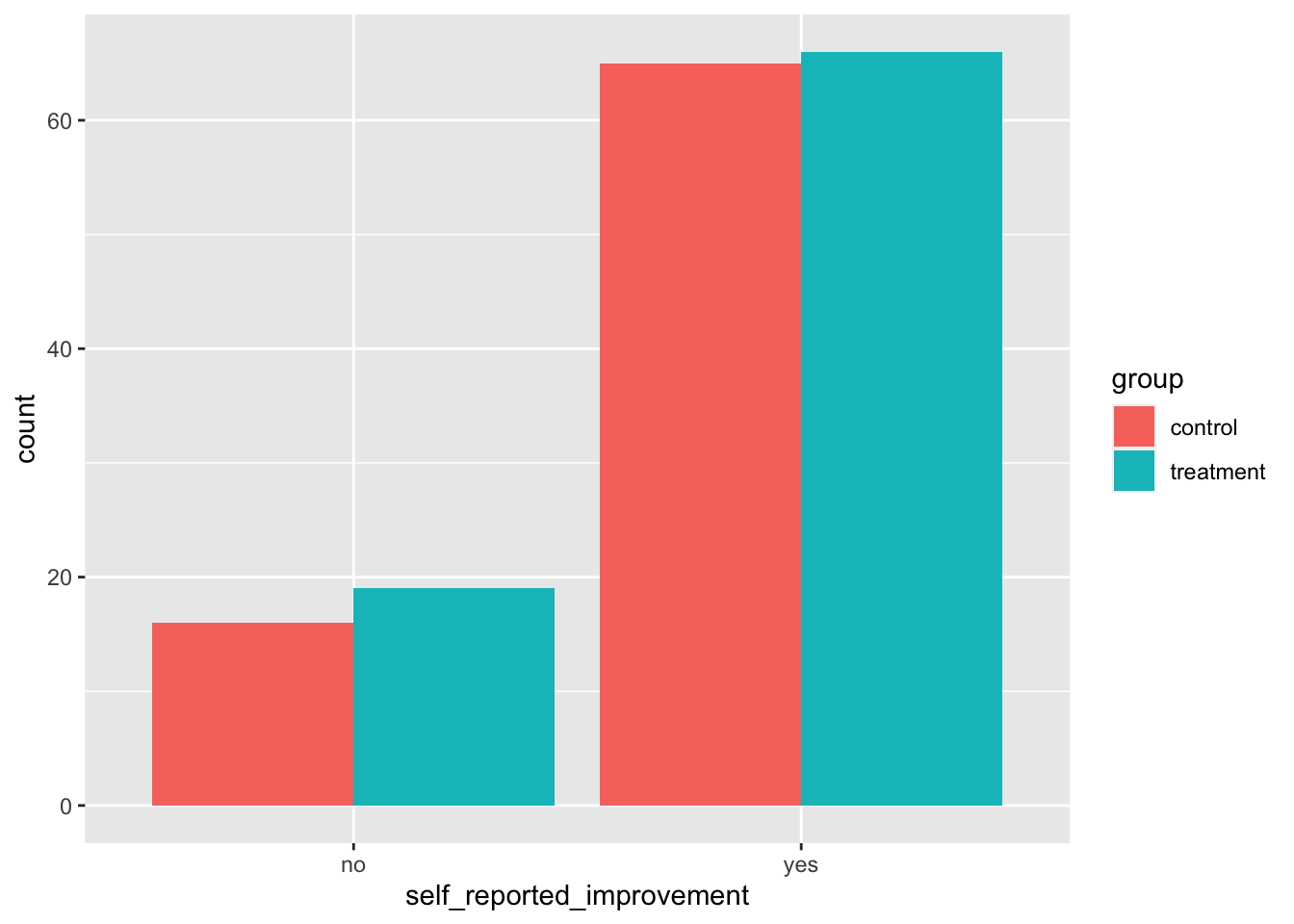
In a previous lab, you learned about side-by-side box plots as one of the tools we can use to compare the distribution of a numerical variable across levels of a categorical variable. We discussed the benefits of this tool. It is common to find bar plots that compare a numerical variable across levels of a categorical variable using a specified summary statistic such as the mean. For example, if you wanted to visualize the mean price across the type of cooling for the houses in the duke_forest data set, we can do this using the steps below:
new_object <- duke_forest |>
  group_by(cooling) |>
  summarise(mean_price = mean(price))
In this code, we send the data set into a group_by function and choose how we want to group (in this case by cooling). Next, we send this grouped data to a summary function in which we specify the summary statistic (in this case mean for the price variable). What do you notice when you run the above code? Click and examine the new object that popped up in the environment area.
The next step is to create bar plot using the new object that we just created from the above step. See below:
ggplot(new_object, aes(x = cooling, y = mean_price, fill=cooling)) +
  geom_bar(stat = "identity") +
  labs(x = "Type of Cooling",
       y = "Average House Price",
       title = "Bar Plot for Average price by Type of Cooling")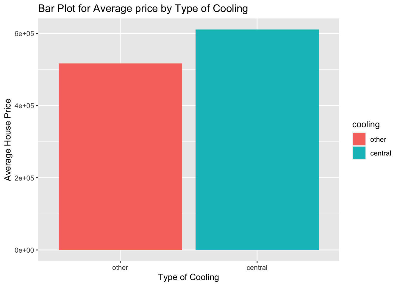
In the bar plot, the values on the \(y-axis\) are in scientific notation because they are too big. We can scale them down by dividing by 1000 so that we have the average in thousands. See below:
ggplot(new_object, aes(x = cooling, y = mean_price/1000, fill=cooling)) +
  geom_bar(stat = "identity") +
  labs(x = "Type of Cooling",
       y = "Average House Price in thousands",
       title = "Bar Plot for Average price by Type of Cooling")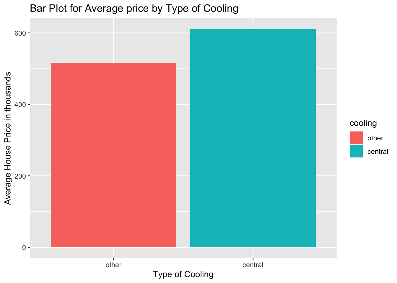
Alternatively, you can create the bar plot in one step by adding the stat and fun arguments. These will specify the summary statistic of choice for the y axis. See the code below:
ggplot(duke_forest, aes(x = cooling, y = price/1000, fill=cooling)) +
  geom_bar(stat = "summary", fun="mean") +
  labs(x = "Type of Cooling",
       y = "Average House Price in thousands",
       title = "Bar Plot for Average price by Type of Cooling")
(2 pts) There is a data set called loan50 contained in the openintro package. Load the data set into your quarto work space.
(2 pts) Run the query ?loan50 command to learn more about the data set then give a brief description of the data set. List any two categorical variables and any two numerical variables in the data set.
(4 pts) Create a simple bar plot to visualize the distribution of the variable loan_purpose. Based on the bar plot, what is the most frequent reason for which people in the sample took loans? What is the least frequent reason(s)?
(4 pts) Create a dot plot to visualize the distribution of the variable loan_amount. Comment on the distribution.
(4 pts) Suppose we want to answer the question, “do people with higher total_income tend to have higher loan_amount?. To answer this question, we can create a scatter plot because the two variables are both numerical. Create a scatter plot to visualize the relationship between loan_amount and total_income. Describe this relationship.
(4 pts) Create a new scatter plot that colors the dots on the scatter plot in question 6 above using the categorical variable has_second_income (i.e., whether someone has a second income or not). Comment on the new scatter plot.
(Extra Credit Question) Create a contingency table to summarize the variables loan_status and home_ownership. Comment on this table.