Code
data(bdims)The normal distribution is one of the most commonly used distributions in statistics. In this lab, we will explore the idea of normal distribution using the bdims data set contained in the openintro package. Note that it reality, it is close to impossible to find a variable that fits a perfect normal (symmetrical) distribution. To assess how best a given distribution follows a normal distribution, we compare it with the theoretical (perfect) normal distribution. We do this by first overlaying a perfect normal curve on top of a histogram of the variable we would like to assess then eyeball to see how closely the two fit. We will then learn about a more accurate tool known as a probability plot (aka a Q-Q plot). We will end the lab by computing proportions given quantiles and vice versa based on the normal distribution.
To create your quarto file, follow the following steps:
Go to File>New File > Quarto document. In the title field use The Normal Distribution then write your name under the Author field. Change the output option to pdf.
Next, save the document as Lab_05. If you did it correctly, the file Lab_05.qmd should appear under the environment.
For more details on creating a quarto file, please check out lab_03a.
Once you create your new file, it comes with some default text and chunks. Feel free to reuse these (recommended option) or delete and start on a blank page. When reusing the template, be sure to rename headings accordingly and change the paragraphs to something more appropriate.
We will need the following packages in this lab. Load them in the first code chunk.
You can copy the following code for loading the packages:
library(openintro)
library(tidyverse)We will stick with the bdims data set. Please load the data set using the code below:
data(bdims)If you cannot see the data under the environment area, it is probably because you have not run the chunk containing the packages above. If you have the data set showing up, run ?bdims to access the documentation to learn more about this data. You can also run the following command to view the first few rows of the data set:
head(bdims)How many variables and how many cases does the bdims data set have? Identify one categorical variable and any two numerical variables.
Suppose we want to examine the distribution of male heights in the sample. Let us start by creating a new data set using the filter function to isolate the men from the data set bdims. We will save this new data set as men_data. Notice that the variable name had values \(1\) for men and \(0\) for women:
men_data <- bdims |>
  filter(sex == "1")
Running the above code creates a new object called men_data in the environment. Click on to examine the data. How many cases does this new data set have?
When studying the normal distribution, two parameters play a central role. These are the mean and the standard deviation. Let us compute the mean male height. You can use the code below:
men_data|>
  summarize(mean_men_hgt = mean(hgt))
# A tibble: 1 × 1
mean_men_hgt
<dbl>
1 178.We compute the standard deviation as follows:
men_data|>
  summarize(men_sd = sd(hgt))
# A tibble: 1 × 1
men_sd
<dbl>
1 7.18Next, let us create a histogram to visualize the distribution of the men heights.
ggplot(data = men_data, aes(x=hgt))+
  geom_histogram(fill = "lightblue")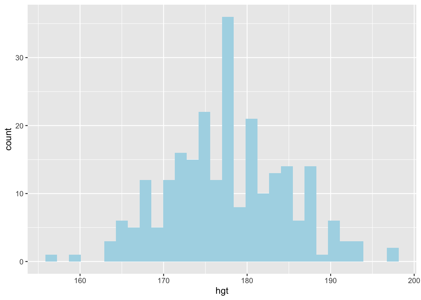
How would you describe the distribution of the heights of the males?
We can also create a box plot to visualize the distribution of the male heights. See code below:
ggplot(data = men_data, aes(x=hgt))+
  geom_boxplot()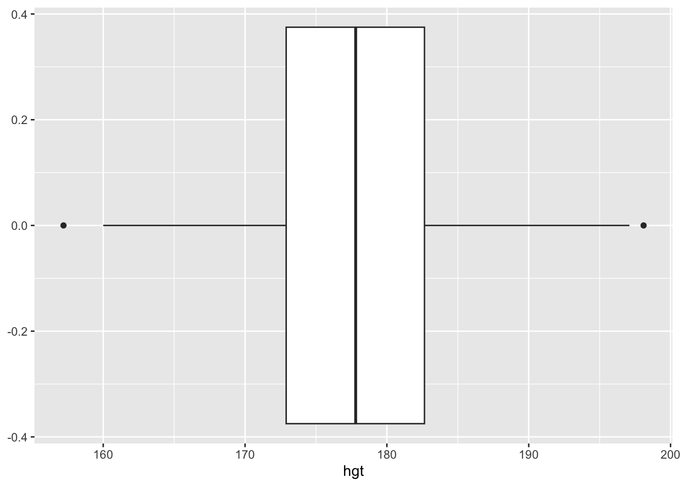
Based on this box plot, how would you describe the distribution of the male heights? Is there anything you learn from the box plot that you cannot from the histogram?
In describing the distribution of the male heights above, you may have used words like nearly symmetrical, nearly normal. But how close is this distribution to a perfect normal distribution?
Let us start by overlaying a theoretical normal distribution on the histogram for the male heights. To make comparisons easier, we use proportions (decimal percentages) on the y-axis instead of the raw frequencies. Second, we create a normal distribution curve (density curve) that has the same mean and standard deviation as the male heights in our data set. See the code below:
ggplot(data = men_data, aes(x = hgt)) +
  geom_histogram(aes(y = after_stat(density)), fill = "lightblue") +
  stat_function(fun = dnorm, args = c(mean = 177.7, sd = 7.2), col = "red")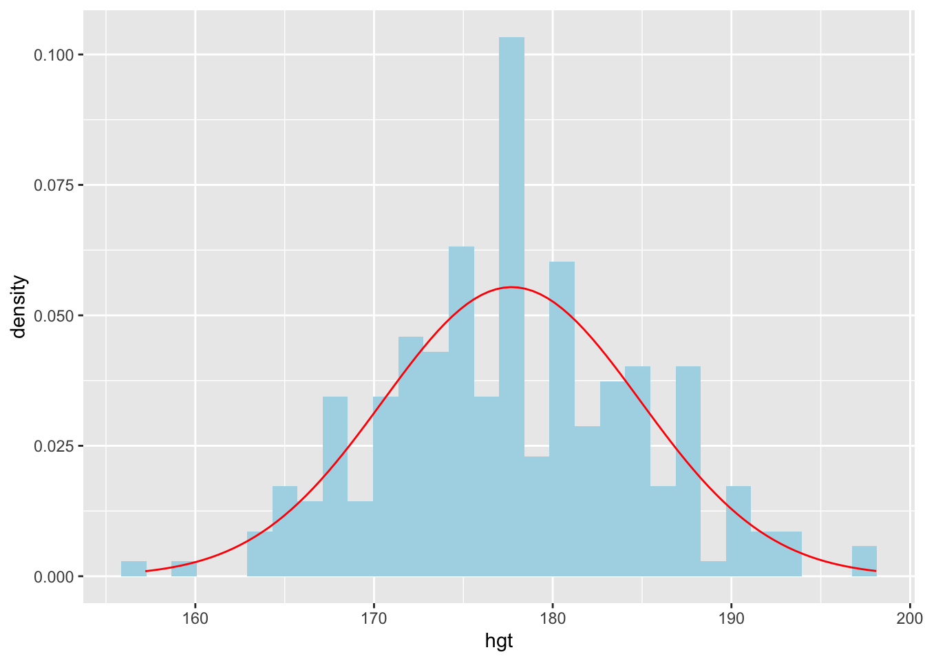
Based on this new plot, how closely do the male heights follow a normal distribution?
It can be difficult to assess how closely the distribution of the male heights follows a normal distribution based on overlaying of the normal curve. A Q-Q plot (quantile-quantile plot in full) or a normal probability plot is another (more accurate) way that is commonly used to assess normality of a given distribution.
ggplot(data = men_data, aes(sample = hgt)) +
  geom_line(stat = "qq")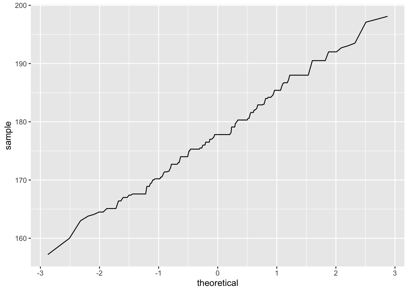
In the above plot, the horizontal line represents the quantiles of a perfect normal distribution with mean 0 and standard deviation 1 (standard normal distribution). The y-axis represents the quantiles (raw values) of the male heights. The zig-zag line you see tells you how close these two are. The closer the line is to a diagonal line, the closer the data follows a normal distribution. A near vertical portion of the line shows the values around there are below the normal curve while a near horizontal one shows the values are above the normal curve.
We can compute the proportion of cases that are above a given height. For example, suppose we want to know the percent of cases that are above 185 cm. We can do by counting the number of cases above 185 cm then dividing by the number of cases n the men_data (i.e., 247). See below:
men_above185 <- men_data |>
  filter(hgt > 185)
# This creates a new data set with males above 165 cm
The above code creates a new data set and stores it as men_above185. The data set has 42 cases meaning there are only 42 men with a height above 185 cm.
Thus,
\[ proportion = \frac{42}{247} = 0.17 \]
The above proportions were computed based on the actual data on men heights. If we assume that the heights follow a perfectly normal distribution with a mean of 177.7 and a standard deviation of 7.2, we can find the proportions without relying on the data. To do this, we use a function known as pnorm.
Below is an example for finding the proportion of men who, according to the perfect normal distribution, would be expected to be above 185 cm tall:
pnorm(q=185,mean = 177.7 ,sd=7.2, lower.tail = FALSE)[1] 0.1553179In making this computation, we recommend that you first sketch the normal distribution to visualize the scenario.
The closer the heights follow a normal distribution, the closer the answers from the data and from the theoretical distribution would be. Here, we have 0.15 and 0.17. These two are fairly close.
Circumstances do arise where you know the proportion of cases but you do not know the quantile value. For example, what height separates the bottom 25% from the top 75% (i.e., first quartile, \(Q_1\))? To answer this question using the theoretical normal distribution above, you can use the qnorm function as follows:
qnorm(p=0.25,mean=177.7,sd=7.2,lower.tail = TRUE)[1] 172.8437In this lab, you will use the bdims data set that was used in class explorations. In case you are using a new quarto file, you will need to load this data into your workspace first.
(2 pts) Create a new data set from the bdims data set that has female cases only. Name this new data as female_data.
(2 pts) Create a histogram to visualize the female heights. Describe the distribution of the heights.
(2 pts) Compute the proportion of females in the data that were over 168 cm tall.
(2 pts) What proportion of females were below 150 cm tall?
(4 pts) What proportion of females were between 150 cm and 168 cm tall?
(2 pts) Compute the mean and the standard deviation of the female heights.
(2 pts) Using the theoretical normal distribution, compute the proportion of cases that would be over 168 cm.
(4 pts) Create a Q-Q plot for assessing the normality of the female heights. Interpret the plot in terms of how close the female heights follow a normal distribution.